Product Design Leader
FinTech App Redesign
Synopsis
At MoCaFi, customers had to manage their finances using two separate apps—one for payments from organizations or municipalities (IRC) and another for demand deposit accounts (DDA). This led to frustration, disrupted personalized service, and low conversion rates between the two products.
Recognizing these challenges, I saw an opportunity to streamline the user experience, resolve customer pain points, improve internal data flow, and boost conversions.
I presented a business case with a SWOT analysis, competitive analysis, and a usability research readout to the CEO and leadership team to get the initiative approved.

Role —
Product Manager, Project Manager & Lead Product Designer
Partners —
Ops, Risk, Legal & Complaiance, Product, Dev, Marketing, Sales
Timeline —
1 year
Challenges
Taking on a hybrid role
Product Manager, Project Manager & Lead Product Designer
Building our data warehouse
Either there was no data intake or any of the data we got from vendors was inconsistent.
Using a new codebase
Flutter was new to us, but we wanted to test its capabilities and durability as our current framework wasn't scalable.
Measuring Success
Boosting conversion & driving adoption
Our tracking showed a small percentage of customers converting from IRC to DDA, with fewer than 13,000 actively using the app.
Seamlessly track performance
This will enable the Product team to make recommendations and informed decisions based on insights.
Reduce customer
pain points
Our hypothesis is that if we reduce any friction or pain points, more customers will use the app on a regular basis.
Results
How I did it
Scope of Work
This initiative focused on creating a foundation to enable us to have a scalable app for future products and services. Through collaborative stakeholder engagement, I built the groundwork for a user-centric solution.

Interviews: Key Findings
Having difficulty finding and completing tasks: Customers want to use the app to transact but are having difficulty finding and completing tasks.
Confused about the information presented: Participants expressed an overwhelming sense of confusion about the information shown to them.
Tools and services were not relevant: The features that appeared prominent were not relevant to their current lives.
Access more resources: Participants expressed a desire to have access to more resources like job coaching and financial coaching.
"Through my bank account, you know how you can do a deposit through a check?...I was trying to do a check deposit, but you guys don't have that"
- Participant 1
"
"When I clicked on tabs I was like what is this? Over time I went back to check what it is but I still don't have a grasp on the app. It could be more user-friendly. As a regular college student I didn't know why the information on credit scores and other things were there."
- Participant 2
"
The research team —

Workshop Facilitation
Bringing the right people into the room early makes everything that comes after move faster. I facilitated cross-functional brainstorming and alignment sessions with stakeholders across Product, Engineering, and Operations to collectively map the current state, surface pain points, and pressure-test proposed solutions before a single screen was designed.
These sessions gave the team shared ownership of the direction and ensured design decisions were grounded in the realities of each stakeholder's domain, not just user research alone.

Wireframes
Stakeholders for buy-in: I worked cross-functionally to ensure we were aligned on the product strategy and any design decisions based on the pain points collected from the interviews. Then, I began creating low-fidelity wireframes and prototypes for testing.


Testing & Iterations
I conducted unmoderated usability tests for each optimization or net new feature using the UserTesting platform. Based on the results, I had to iterate on the design and retest. Other times, I conducted A/B testing to gauge which design would perform better.

A/B testing the ability to find recent transactions
The test focused on changing the CTA for Recent Transactions.
Result: (A) performed better, with users spending an average of 7 seconds looking for recent transactions, compared to (B), where users spent an average of 65 seconds searching for their recent transactions.
Iterations
I designed a series of navigation bars and ran tests on them to get an idea of what activities are most commonly used by customers who use banking apps regularly. This helped inform what tabs we would place as main nav items in the app.
Result: Most users expressed that they regularly configure their app (settings), look at their balance, and check their transactions. I used these insights to inform the navigation.

High-fidelity Comps
Once the wireframes were in a good place, I moved on to creating high-fidelity comps, strategically focusing on how the app could be visually designed in a way that would adapt to any client branding while remaining attractive.
Usability
Research told a clear story: users knew what they wanted to do but couldn't find where to do it. I ran usability tests and navigation iterations to identify which tasks customers needed most and where they expected to find them. Those insights directly informed the home screen and navigation structure, placing the highest-demand actions where users naturally looked first.
AI Technology
To deliver a personalized experience that felt relevant to each user, I leveraged AI to dynamically surface the resources, education, tools, and opportunities most aligned with their individual financial goals and activity. The result was an app that adapted to each customer rather than presenting a one-size-fits-all experience, driving stronger engagement, goal completion, and long-term retention.


Marketplace
I heard an overwhelming desire from users to access more resources beyond basic banking. In response, I designed a marketplace that brought financial coaching, education, deals, and events into a single destination within the app, giving customers the tools to actively work toward their financial goals rather than just manage transactions.
Recognizing MoCaFi's broader goal of expanding revenue, I saw the marketplace as an opportunity to open new monetization channels, creating a space that delivered real value to customers while generating new opportunities for the business.
Self Service Capabilities
I partnered with Relationship Managers and Customer Service Managers to identify the most frequent customer requests that could safely be resolved without agent assistance. Rather than treating call center volume as a business problem alone, I saw it as a signal that customers needed more control over their own experience.
That insight led to designing self-service capabilities directly into the app, starting with card locking, unlocking, and replacement, giving customers immediate access to actions they previously had to call in for, reducing friction and call center load at the same time.

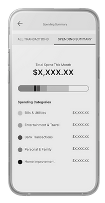
Retention
I designed the Spending Summary to give customers a clear, visual picture of their income and expenses, a tool that made the app worth opening even when there was nothing to act on. The goal was to create a reason to stay, not just a reason to transact.
Beyond the customer value, the Spending Summary served a deliberate business purpose. I designed it to incentivize direct deposit enrollment by unlocking its full potential for customers who signed up, driving deeper product adoption, and accelerating conversion from IRC to DDA. Keeping customers engaged between transactions meant MoCaFi stayed relevant to their financial lives long after onboarding.


Transparency & Efficiency
Research made it clear that customers were abandoning onboarding not because they weren't interested, but because they didn't know what they were getting into. One participant said it best: "Is there a lot left? Can I skip the ID part? I won't get approved, my credit ain't good right now."
I redesigned the 26-step flow down to 14 by removing unnecessary steps, reordering questions so reusable data appeared first, auto-populating fields to eliminate duplicate entry, and making ID verification optional for customers with a Social Security Number. I also added a progress bar and rewrote the copy in plain language so customers always knew where they stood.
Average completion time dropped by 3.89 to 4.89 minutes, manual review rates improved from 31% to 27%, and approved applications increased.

Design System
From scratch
I made the deliberate decision to build our design system from scratch alongside the redesign, knowing that without one, we'd be creating design debt from day one. I led a team of designers through the process, establishing the component library, documentation standards, and governance rules that would keep the product consistent as it scaled.


Takeaways
Leading this initiative as the product manager, project manager, and lead designer at the same time was one of the most challenging and clarifying experiences of my career. When you understand how each discipline works, you make better decisions in all of them.
What I walked away with was more than a strong case study. It was a deeper conviction that the best design outcomes happen when you stay close to the user, bring the right people in early, and build the kind of systems and relationships that make great work repeatable.
The team crushin it per usual —


